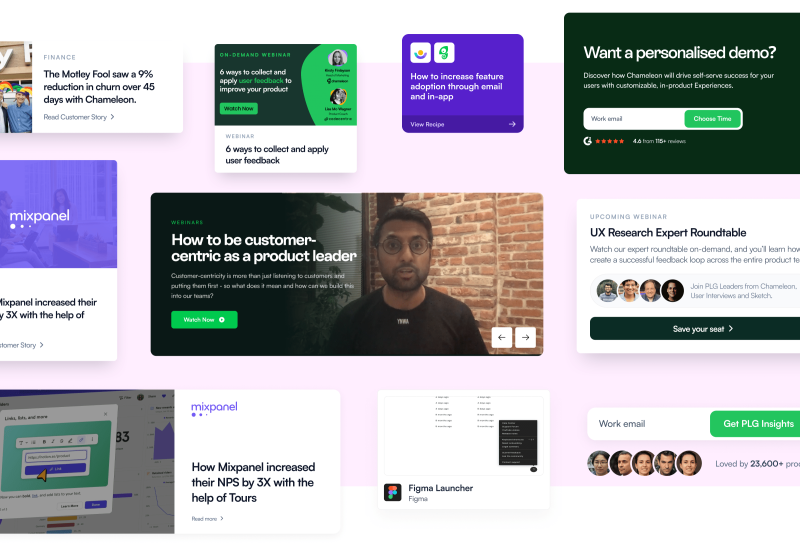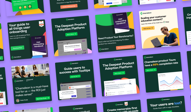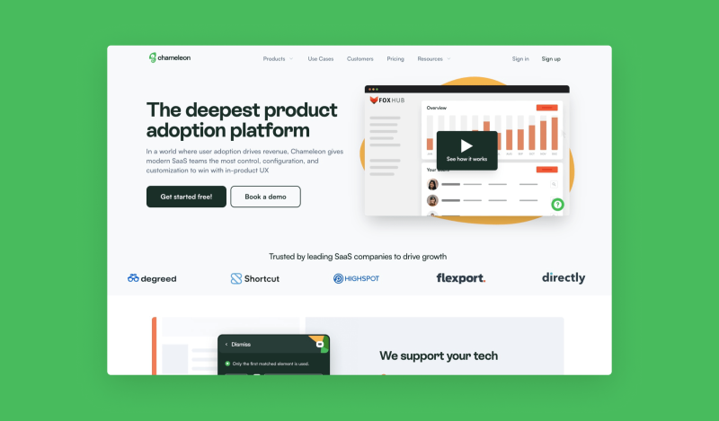
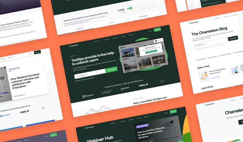
Chameleon gives SaaS teams a powerful platform to build tours, tooltips, surveys and launchers to help drive product adoption without writing any code. We worked deeply with the team at Chameleon to redesign their website and paid ad creatives to be consistent with their new brand rollout in time for their $13M Series A announcement.
Chameleon planned to roll out their new brand refresh and the team wanted their website, paid ad creatives and illustrative assets needed to be redesigned to keep the brand consistent and cohesive across all their platforms and customer touchpoints.
We used this period of transformation to also focus on increasing conversion on both the website and paid ads. As an agency, we take a very lean and data-driven approach. This involved updating key pages in the customer's website journey and A/B testing an array of component variations and ad creative formats to see which performs better.
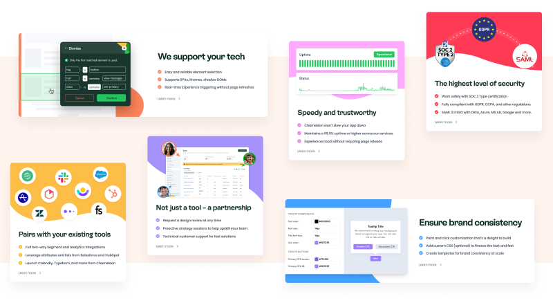
One of the core reasons for Chameleon deciding on a full brand refresh was because they wanted to make it easier for people to differentiate their brand from their competitors. During a sprint, we redesigned the homepage and decided to take this goal further than just updating visual elements but to build a section highlighting the core reasons that push customers to choose Chameleon over their competitors.
As with every update to a high-traffic page, we opted to run an A/B test with this new section just below the hero. We used Google Optimise to run a 50/50 split of traffic between the existing homepage and the new one highlighting the features we knew customers needed that our competitors did poorly or not at all.
Chameleon boasts a marketing team of super-talented content writers that produce new landing pages and update existing ones on a weekly cadence. With these new and updated pages comes the need for static and animated assets to visually illustrate the key features and benefits in the accompanying copywriting.
We set up a new board in Trello and utilised Zapier to connect a custom form to ask an array of questions that would provide us with enough context and information to create the assets without any unnecessary back-and-forth communication. Our team then go through the backlog of requested assets and deliver these weekly in order of their priority level.
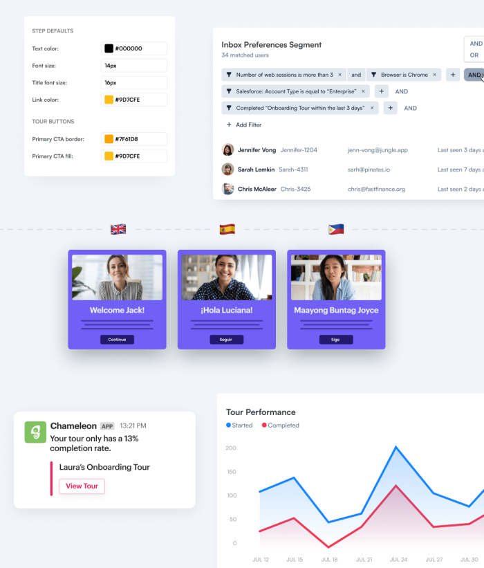
As we went through the existing site and updated the assets, we saw an opportunity not only to make the assets consistent with the new brand but to improve how they convey the features and functionality of Chameleon's platform in a less convoluted way. Our team includes talented animators and motion graphic designers and we utilised this to produce a series of animated videos to use primarily in the hero sections of the core product pages. These animations were able to demonstrate how Chameleon's experiences work more effectively and are able to show it in a greater context than static image assets ever could.
Chameleon already had an existing website and technology stack for their marketing website. Fortunately, it was the exact same setup we use with all our clients. We opted to build 'blocks' for the website that would be reusable and editable across the entire website. This modular approach allows Chameleon's talented marketing team to move quickly, test ideas and build new pages without needing development work.
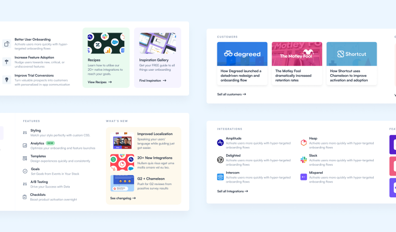
The navigation bar on the website hadn't been updated in a long time and as the catalogue of content, resources and taxonomies grew at a fast rate we saw an opportunity to allow the marketing team to have a high level of customisation so they could experiment with bringing key pages and resources to a prominent and visible location.
As we did with the landing pages, we also took the strategy of creating reusable components that Chameleon could utilise to build their navigation bar dropdown menus. The marketing team now have complete control of what content goes into each dropdown menu and can rearrange, edit the content, add or remove blocks and alter the color and styling in seconds via the Content Managment System.
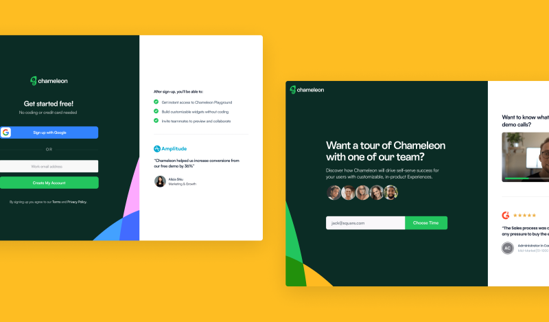
For Chameleon, one of the most important types of conversions was for a prospect booking a demo. We worked together to pinpoint where we should focus our optimisation efforts by watching session replays in Hotjar and digging deep into Mixpanel data to visualise funnels and identify dropoff points. We then researched the best way to improve these points in the user's journey and tested our hypothesis by A/B testing variations with Google Optimise.
The previous demo page was very bare and lacked substance. We initially focused on trying to address the prospect's concerns and doubts, when they land on the demo page they have no idea what the demo entails.
As always, we took a very lean approach and moved quickly to test our hypothesis by adding a checklist to break down what the demo call covers. Later we revisited the page and replaced the checklist with a video of Jake, an SDR at Chameleon, introducing himself and addressing the concerns himself. Adding the video made the traditionally tedious experience of buying software more personal and introduced a level of familiarity with the team much higher up the funnel than that of competitors. We iterated on this idea further and added photos of the sales team above the booking form. The existing customer testimonials were also replaced as they lacked relevancy in their given context, we opted for a quote from Chameleon's G2 profile that specifically mentioned having a positive experience with the sales process.
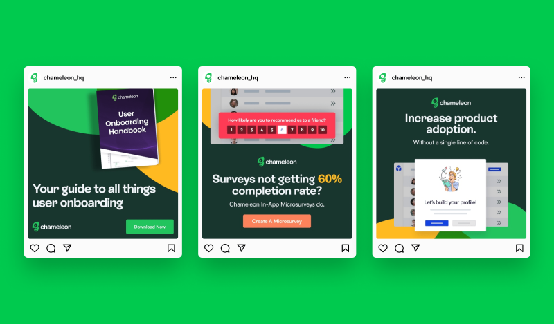
When we approached designing the ad creatives for Chameleon, we were supplied with an in-depth and comprehensive guideline document accompanied with brand assets, shapes, typography and color palette which allowed us to easily keep the ad campaigns on-brand without doubts or confusion.
Alongside updating the existing campaigns we worked on a range of new campaigns. To help the Chameleon team reach their ambitious advertising targets we designed eye-catching ad creatives to drive greatstrong results across multiple platforms and formats such as Google Display, Facebook, Instagram and LinkedIn ad campaigns.
When we updated the existing ad creatives to new on-brand static images we felt the ads lacked the level of context and depth to demonstrate the power and leverage Chameleon gives its customers. Video ads can typically get a 2x increase in clicks compared to image ads so we wanted to test and experiment with how they performed on Chameleon's account.
A core theme across all departments in Chameleon is the focus on data and metrics to drive decisions rather than relying on assumptions or speculations. At Siguro we also share this approach and designed a huge array of ad creatives across all the campaigns we worked on. Rather than making guesses on which ad creative style would perform the best we used hundreds of variations to test which variants performed the best and then took the results of this into account for each new campaign we worked on.