 Book a chat
The short version
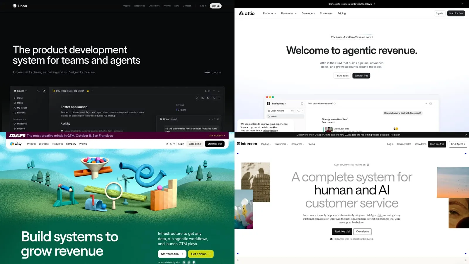
- I looked at the homepage hero of 8 well-known SaaS companies and asked one question: could a stranger say what they sell after five seconds?
- 3 pass on the headline alone (Linear, Intercom, Retool). 3 only pass because the line under the headline does the work (Attio, Rippling, Ramp). 2 don't pass at all (Clay, Vercel).
- The most common mistake isn't design. It's a headline that could belong to any company.
- Below: all 8 heroes, what I'd steal from each, what I'd change, and a scorecard you can use on your own page.
Most SaaS landing pages don’t have a design problem. They have a sentence problem.
The headline is the biggest text on the page and the first thing anyone reads. On a lot of SaaS sites it’s also the line that tells you the least.
I spend most of my week designing and building these pages for B2B SaaS teams, and the question I ask first is always the same. I call it the stranger test: show the hero to someone who has never heard of the company, give them five seconds, and ask what the product does.
So I ran it on 8 homepages people usually hold up as good examples:
- Linear: “The product development system for teams and agents.” Passes.
- Intercom: “A complete system for human and AI customer service.” Passes.
- Retool: “Secure your vibe-coded apps.” Passes, for a narrower reader.
- Attio: “Welcome to agentic revenue.” Fails, then the subheadline saves it.
- Rippling: “AI that knows your company, and acts like it.” Same.
- Ramp: “Time is money. Save both.” Same, if you can see it.
- Clay: “Build systems to grow revenue.” Fails.
- Vercel: “Agentic Infrastructure.” Fails.
These are good companies with good designers. That’s the point. If they get the headline wrong, anyone can.
(I checked every page on 1 October 2026. Homepages change all the time, so some of this will be out of date by the time you read it.)
1.) How the stranger test works
It’s deliberately crude.
Look only at what’s on screen before you scroll: the headline, the line under it, the buttons, and whatever picture sits next to them. Then try to finish this sentence in plain words: “It’s a ___ for ___.”
If the headline alone gets you there, it passes. If you need the subheadline, it’s rescued. If you still can’t say it after reading everything, it fails.
The five seconds matter. Most people read the headline, glance at the picture, and decide whether to keep going. A lot of them never read the smaller line underneath.
2.) Three that pass on the headline
Linear
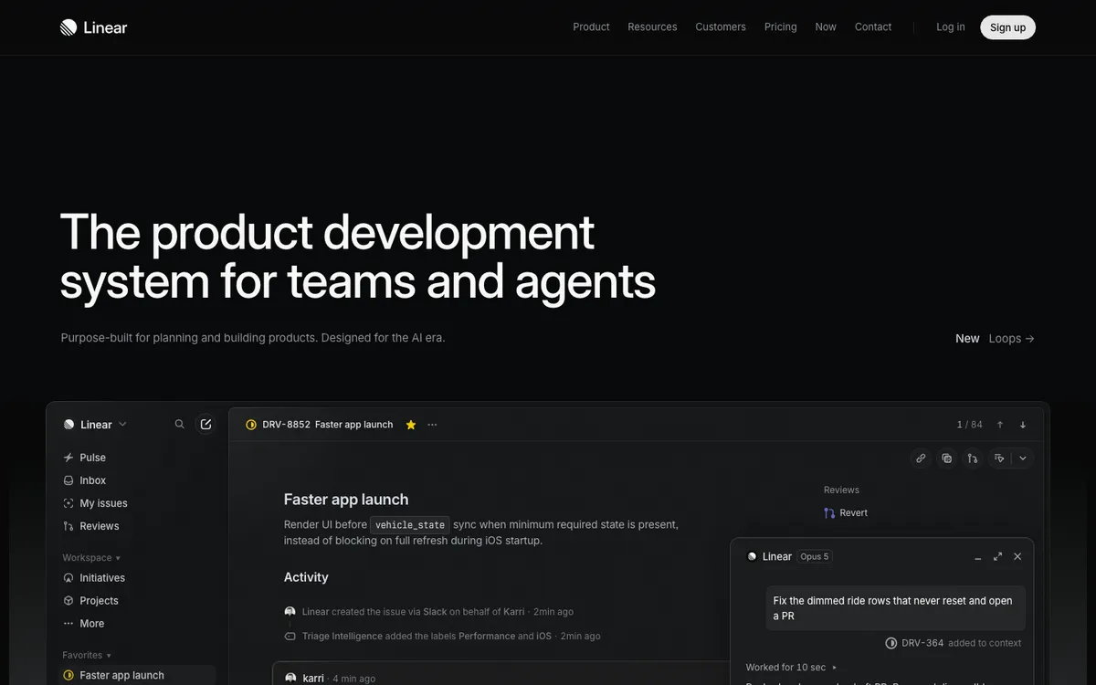
“The product development system for teams and agents.” You know it’s for building software, you know it’s for teams, and the word “agents” tells you it’s current.
Then the screenshot does the rest. It’s the real app, showing a real-looking issue with an AI agent working on it in a side panel. You don’t need to read anything else to get it.
Steal: the product screenshot sits right under the headline and fills the width. No illustration, no mockup, just the thing.
Change: there’s no button in the hero at all. The only way in is “Sign up” in the top corner. Linear can afford that because people arrive already wanting it. Most companies can’t.
Intercom
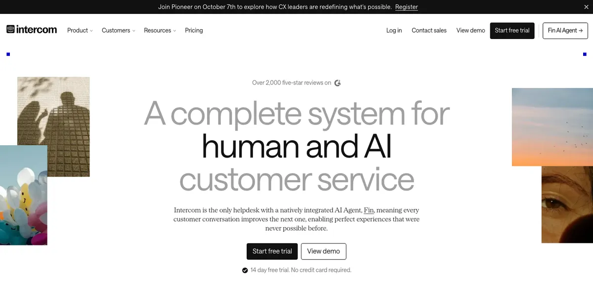
“A complete system for human and AI customer service.” It’s long, but every word earns its place. You know the category (customer service), and you know the angle (people and AI together).
Two buttons, “Start free trial” and “View demo”, plus “14 day free trial. No credit card required.” under them. That line answers the question most people have right before they click.
Steal: the reassurance line under the buttons.
Change: the pictures around the headline are photos of shadows, balloons, a sky and an eye. They look nice and tell you nothing. A real inbox with Fin answering a customer would do more.
Retool
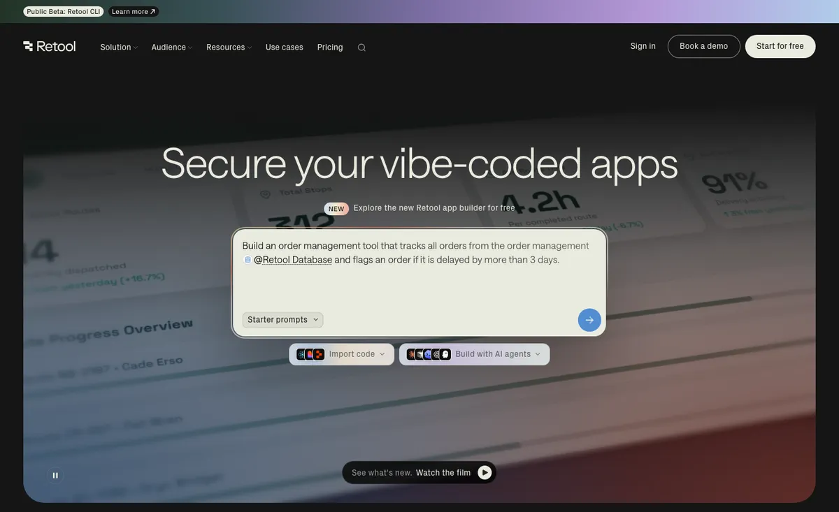
“Secure your vibe-coded apps.” Very specific. If you’ve built internal tools with AI and you’re nervous about it, this is written for you.
The hero is also the product. It’s a prompt box with a real example already typed in (“Build an order management tool that tracks all orders…”), so you can see what you’d do on day one.
Steal: the prompt box with a real example in it. It shows the product and gives you something to click at the same time.
Change: it’s a narrow promise for a company that does a lot more. If you came to Retool for dashboards or workflows, this headline isn’t about you. There’s also a lot going on around it: a “new app builder” link, the prompt, “Import code”, “Build with AI agents” and “Watch the film”, plus two buttons in the menu.
3.) Three where the subheadline does the work
This is the most common pattern I see on client sites too. The headline is a slogan, and the real explanation is in smaller text underneath.
It works if people read the second line. Plenty don’t.
Attio
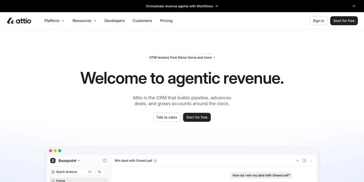
“Welcome to agentic revenue.” Fails the test. “Agentic revenue” isn’t something anyone buys, and you can’t tell what the product is.
Then: “Attio is the CRM that builds pipeline, advances deals, and grows accounts around the clock.” That’s a great line. It names the category (CRM) in the first four words.
Steal: “Attio is the CRM that…” Naming the category that plainly is rarer than it should be.
Change: swap them. Make the CRM line the headline and let the slogan be the small text.
Rippling
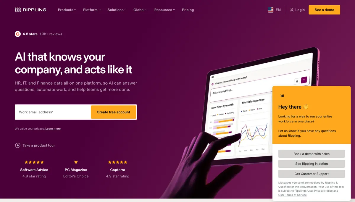
“AI that knows your company, and acts like it.” Could be any AI company. You’d guess it’s something to do with work, but not what.
The subheadline fixes it: “HR, IT, and Finance data all on one platform.” Now I know.
Steal: the review line above the headline (“4.8 stars, 13k+ reviews”) and the three ratings under the form. It’s proof, placed where the doubt is.
Change: there’s a lot asking for attention at once. A work email field, “Create free account”, “Take a product tour”, “See a demo” in the menu, and a chat widget that opened by itself with three more buttons in it. Pick one main thing for the hero to do.
Ramp
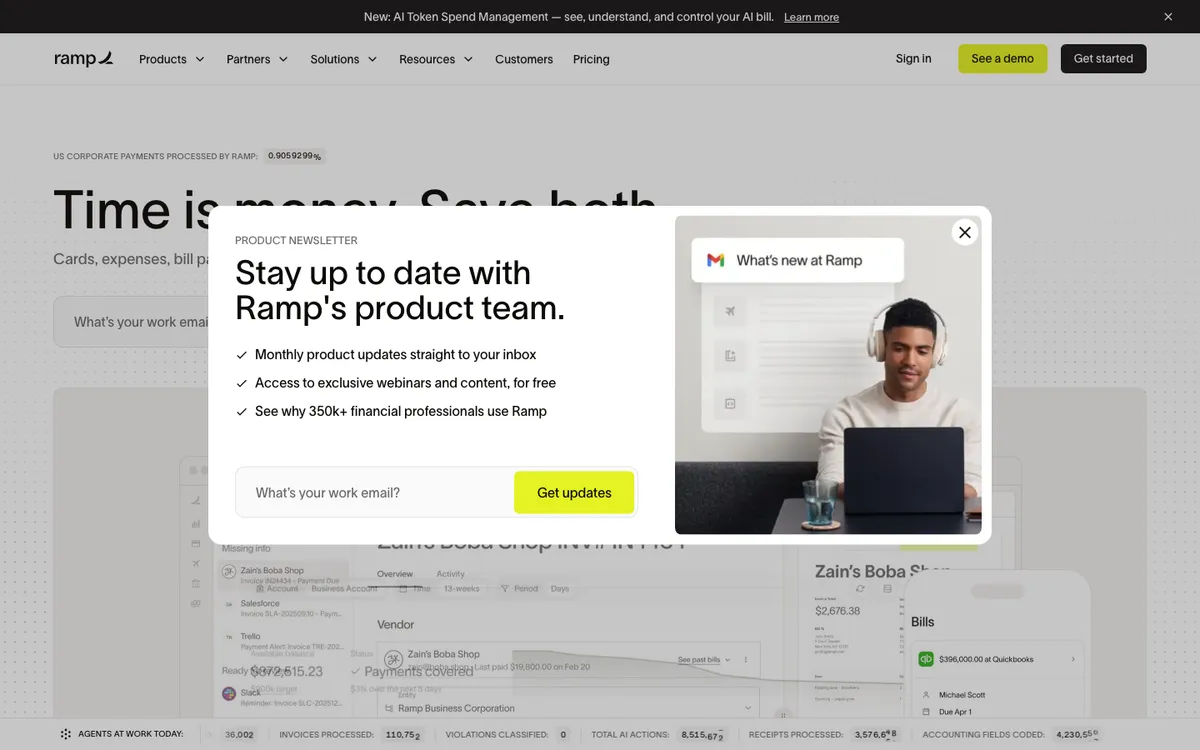
“Time is money. Save both.” A good line, but it could sell almost anything. The subheadline underneath lists cards, expenses and bill payments, which is what tells you it’s spend management.
And then, a few seconds after I landed, a newsletter pop-up covered the headline, the subheadline and the product shot. (That happened on my visits. It may depend on the visitor.)
Steal: the live counters. There’s a ticker along the bottom of the hero showing invoices processed, receipts processed and other work being done that day. It’s proof that the product is busy, not just a claim.
Change: let people read the hero before asking for their email. The first five seconds are the ones you can’t get back.
(A small aside I didn’t expect: when I loaded ramp.com with a headless browser for the screenshots, it served a plain text “machine version” written for AI agents instead of the normal page. Ramp has written about doing this on purpose. It’s the most serious attempt I’ve seen at a landing page for agents.)
4.) Two that only work because you already know them
Clay
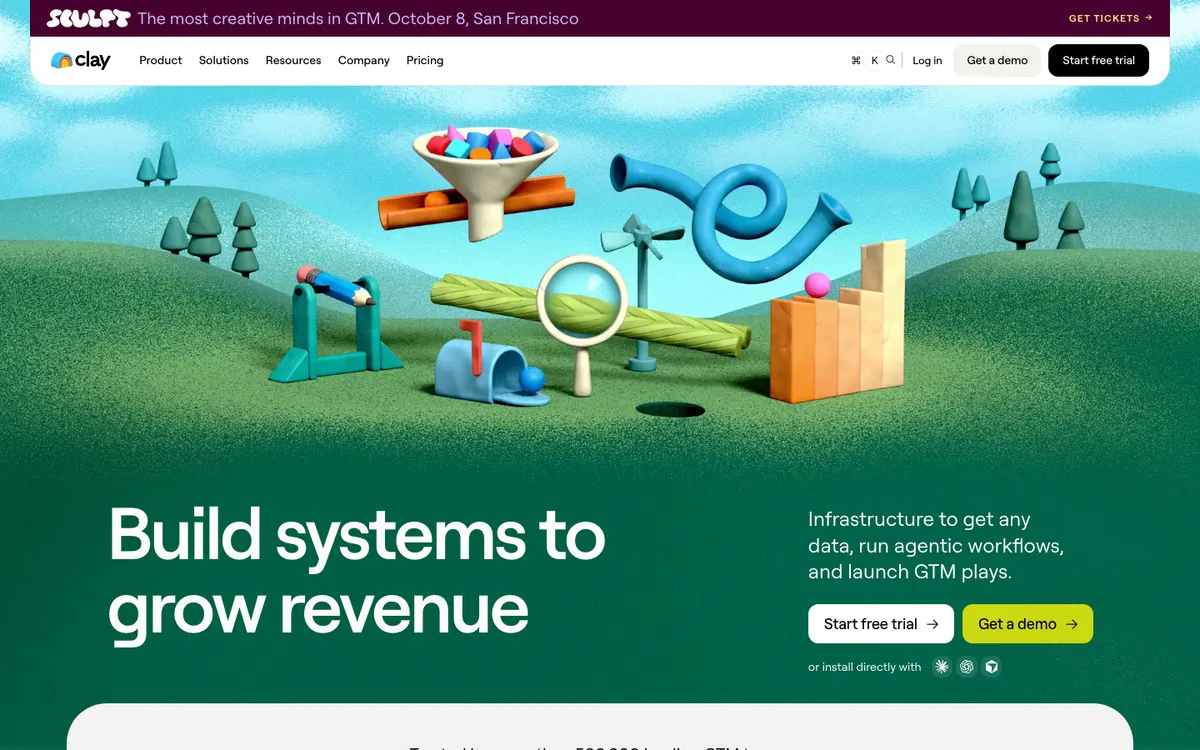
“Build systems to grow revenue.” Fails. So does the line next to it: “Infrastructure to get any data, run agentic workflows, and launch GTM plays.” If you don’t already know Clay, you still don’t know what it is.
The picture is a lovely 3D machine made of funnels, tubes and a magnifying glass. It’s memorable and it’s on brand. It isn’t the product.
Steal: the illustration style, honestly. It’s the most recognisable hero of the eight.
Change: nothing, if you’re Clay. Their visitors mostly arrive knowing the name. If you’re not that famous yet, don’t copy this. A hero that assumes people already know you only works when they do.
Vercel
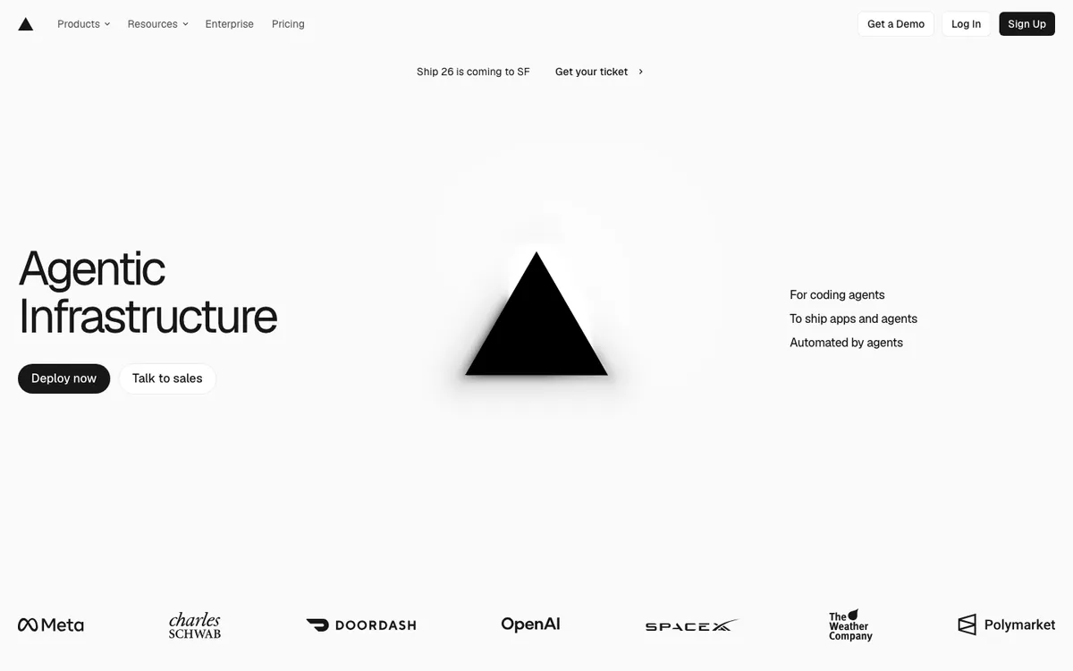
“Agentic Infrastructure.” Two words. Next to it: “For coding agents. To ship apps and agents. Automated by agents.”
A developer who already uses Vercel will nod. A stranger learns that it involves agents, which describes most of the internet in 2026.
Steal: the logo row under the hero. Meta, OpenAI, DoorDash and others, big and clear. For a technical buyer, that list says more than a paragraph.
Change: one plain sentence about what Vercel does (it hosts and runs web apps) would cost nothing and help everyone who isn’t already a customer.
5.) The scorecard
| Page | Headline | Stranger test | Real product shown | Things to click in the hero |
|---|---|---|---|---|
| Linear | The product development system for teams and agents | Pass | Yes, the app | 0 (sign up is in the menu) |
| Intercom | A complete system for human and AI customer service | Pass | No, photos | 2 |
| Retool | Secure your vibe-coded apps | Pass | A prompt box | 5 |
| Attio | Welcome to agentic revenue. | Rescued | Yes, the app | 2 |
| Rippling | AI that knows your company, and acts like it | Rescued | On a tablet | 2, plus a chat widget with 3 |
| Ramp | Time is money. Save both. | Rescued | Yes, then covered | 1, plus a pop-up |
| Clay | Build systems to grow revenue | Fail | No, illustration | 2, plus 3 install icons |
| Vercel | Agentic Infrastructure | Fail | No, the logo | 2 |
Things to click counts buttons, links and inputs inside the hero, not the menu bar. Checked on desktop, 1 October 2026.
6.) What I’d change first on most SaaS heroes
If a client asked me to fix their homepage and I only had an hour, this is the order I’d go in.
Write the “It’s a ___ for ___” sentence first. Then see if the headline can simply be that sentence. Attio’s subheadline already is. Most teams have this line somewhere; it’s just not at the top.
Show the real product. A real screen, cropped tight. Linear and Attio both do this and they’re easier to understand for it.
Give the hero one job. One main button, maybe one quieter one. Everything else can wait until the second scroll.
Answer the next worry right under the button. Intercom’s “No credit card required” is the pattern.
The same test works past the hero, too. When we worked on Chameleon’s site, the demo page had the same problem. It asked people to book a call without telling them what the call was.
So we tested it in small steps. First a checklist of what the demo covers. Then a short video of Jake, one of their SDRs, introducing himself and answering the usual doubts. Then photos of the sales team above the booking form, and a G2 review that talked about the sales process instead of a generic testimonial.
None of that was clever. It just answered the question a stranger has at that exact moment.
❝ They move super quickly and we're able to be very lean, test and iterate effectively.
What I’m watching
This is how these 8 pages looked in October 2026. I’ll update the post when they change, and some of them change every few weeks.
The thing I keep noticing is one word. “Agentic” is in Attio’s headline, Vercel’s headline, Clay’s subheadline and Webflow’s page title. When four big companies use the same word in the same place, it stops telling anyone anything. My guess is the companies that say plainly what their agents do will stand out next year. I don’t know that yet.
I’m also watching Ramp’s machine version. If landing pages for AI agents become normal, the stranger test gets a second reader: a model with no patience at all.
Which SaaS homepage do you think passes the stranger test best? And who did I miss? I read all replies.
Receipts
| Page | What I looked at | Source |
|---|---|---|
| Linear | Homepage hero, desktop | linear.app, 1 Oct 2026 |
| Intercom | Homepage hero, desktop | intercom.com, 1 Oct 2026 |
| Retool | Homepage hero, desktop | retool.com, 1 Oct 2026 |
| Attio | Homepage hero, desktop | attio.com, 1 Oct 2026 |
| Rippling | Homepage hero, desktop | rippling.com, 1 Oct 2026 |
| Ramp | Homepage hero and pop-up, desktop | ramp.com, 1 Oct 2026 |
| Ramp | The machine version for AI agents | Ramp Builders |
| Clay | Homepage hero, desktop | clay.com, 1 Oct 2026 |
| Vercel | Homepage hero, desktop | vercel.com, 1 Oct 2026 |
| Webflow | Page title uses "agentic" | webflow.com, 1 Oct 2026 |
| Chameleon demo page | What we changed and tested | Our Chameleon case study |
→ Hand this table and your own homepage to your AI agent, and ask it to run the stranger test on you.